
Helen was very inspired, in fact quite captivated by the way ice had formed on the top of a container of water during last winter. She described it as an "ice sculpture" in her notes and was drawn to the "sharp, crisp shapes" and "the colours in the reflections" rather than what it actually was - which means a giant step forward in understanding - see things as abstract qualities in form, colour and texture.Thinking back to those first exercises in assignments one and two, she was here drawing out the qualities which impressed her in particular, thinking about them quite consciously and writing down her impressions and how she felt about them. She writes in her notes that she wants to construct a garment which emphasises those qualities, maybe making a waistcoat with "a crisp shaped outline" to reflect the "hard V of icicles" - that is the shapes they form.


Note that from this point onwards Helen was actively refining her decision making all the way, step by step through the process, keeping her mind continually on the best way to achieve the effects she had already highlighted. She had already established that she liked printing and painting on fabric from the previous assignment, particularly on satin and crystal (white) organdy. Her lot of her fabric manipulation samples from the work just prior to this project heavily featured these fabrics. Initially she experimented with snow crystal shapes in blue and silver fabric paints because these suggested an icy feel. When these failed to give the feel she wanted, she quite wisely switched to other colour combinations in order get the effect she was after. I think this is a great lesson in going beyond the obvious, icy may suggest blue and silver but somehow it wasn't working, so Helen pressed on until she found a combination which did it for her.

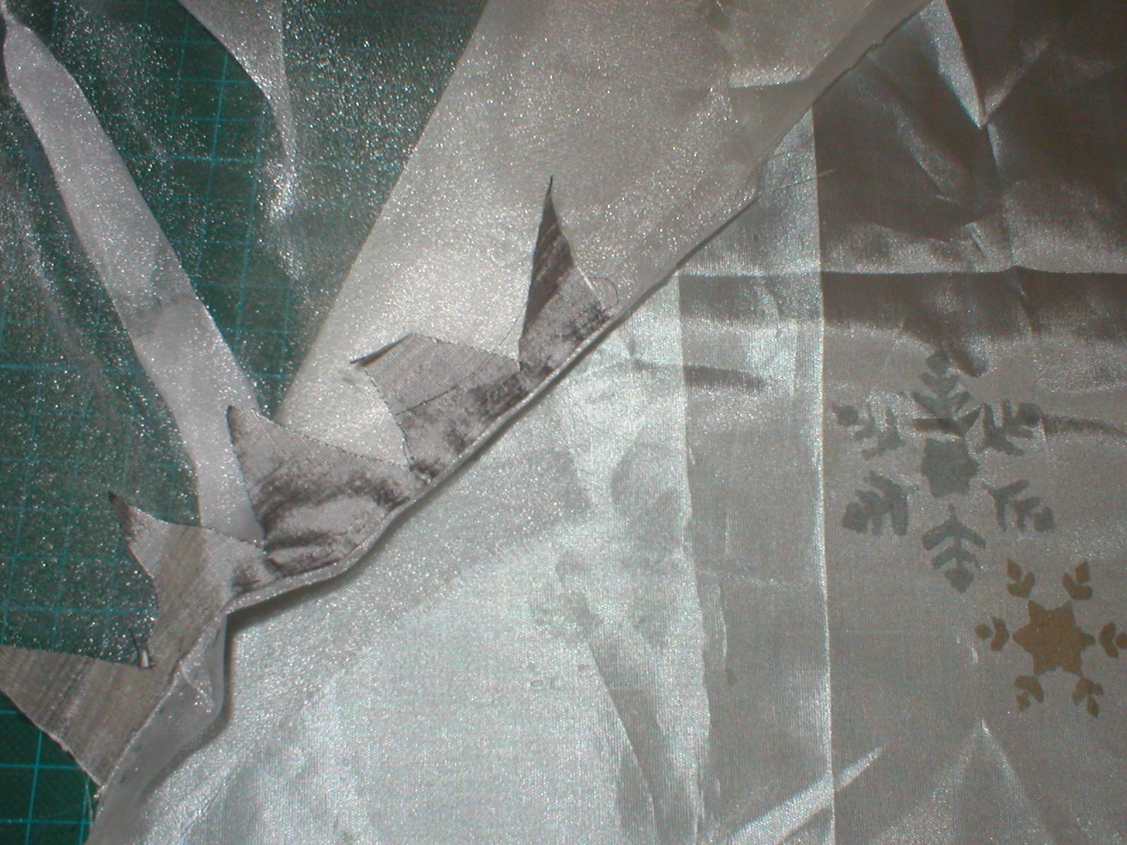

If you look at some of Helen's initial sketches (apologies for quality here as I am not a proffesional photographer by any means) you will see that they are not complicated, but nonetheless are good working drawings in that they carry her ideas and get the salient points down as clearly as possible. Her sampling by means of fabric printing, fabric manipulation and testing some of the construction processes are trials, back and forth between the drawings and the actual materials, trying out ideas, refining and selecting the best options all the way through.

Making a paper pattern just to see if everything fitted together correctly was a good step, as was placing all the actual motifs where they were going to end up, to see if it looked and felt right before the final making up. A Moodboard and a full working calico mock up could also included if you were going for gold, but to be honest, this was meant to be a small project and so not strictly necessary here. Helen was concerned that her finishing was not perhaps good enough, but to be honest it was very good. A lot of it was handsewn and left unpressed, which gave the fabric a puffy look (instead of carefully flattened seams) which to my mind added to the 3D, slightly snow driven, natualistic effect. See what you think?


I like the way you are left in no doubt what were the important aspects here - those big, sharp, triangular shapes to the bodice clearly emphasise those sharp, icy edges Helen was drawn to and excited by. The grey and off white printing adds to this icy feel, but they are not overdone - the minimum of motifs just keep that subtle balance and suggestion of frostiness. The fabric selection was well thought through and the project not over complicated, simple but very effective in carrying through the ideas. Also I have to say that what impressed me beyond the final piece, was the way Helen expressed her thoughts through every step of the way; doing her thinking through the medium of her sketchbooks, both in written notes and design work. To me the final piece has the feel of theatrical costume about it - I can see this is a production of the Ice Queen or a panto on ice - anyone else agree? Any comments or feedback to Helen would be most welcome.